
There has been a problem with printing solid fill that form family symbols in Revit using vector graphics since.. well.. forever.
You might have experienced it yourself in the past, I have found though that it mostly affects electrical documents as they have a high proportion of symbols that use solid fills; maybe you have had an essential GPO print as a non-essential, emergency light symbols not printing correctly or distribution boards showing as control panels.

In the engineering world, these problems can be pretty disastrous, especially during the tendering process. The last thing you want is contractors putting together a price based on incorrect symbols due to prints that just aren’t quite right.
The problem is fairly well documented as well with questions asked and blog posts made and everyone just seems to deal with it by responding with “Oh yeh.. You know you should be printing in raster right?” or better yet “Just replace all your hatching with really close lines”


Because afterall, that is what everyone wants to spend the rest of their life doing; drawing a series of lines to emulate a hatch pattern so they can overcome printing problems.
Some people even say that it has been fixed, but I can tell you for certain that working on a project in Revit 2015 the problem is definitely not fixed.
But is it a Revit problem? I’m not so sure. What if I told you that you actually can print your solid fill patterns and print them in vector? You’ll kick yourself when you realise how simple the solution is.
Dots per square inch.
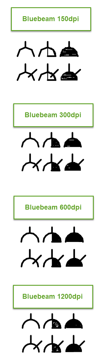
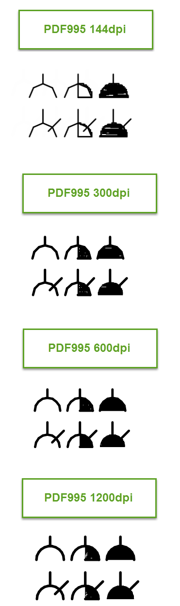
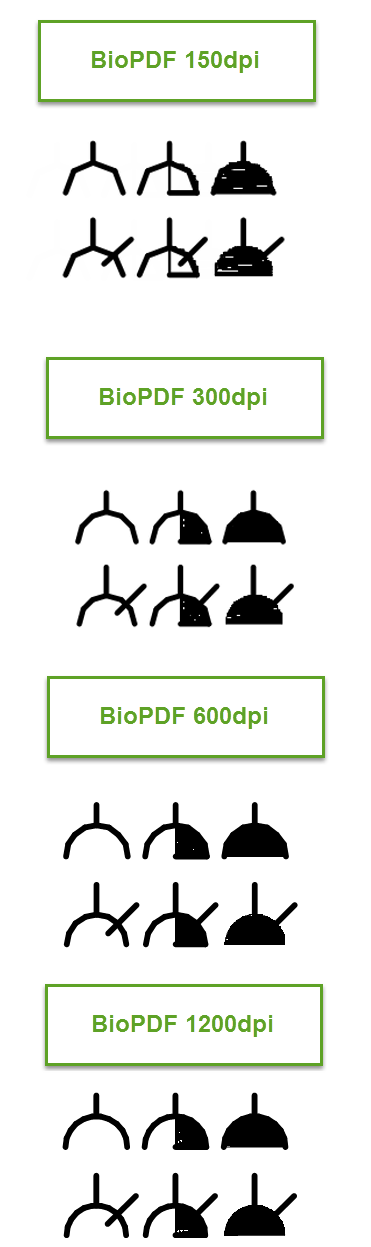
That’s it. The DPI setting you have configured your PDF printer to is the problem. I’ve done a comparisson on some electrical GPO families that I have created between Bluebeam, PDF995 and BioPDF. In each case I printed in 150, 300, 600 and 1200dpi, with the exception of PDF995 where 144dpi was the closest available option to 150.
Basically the root cause is that the filled area you are trying to print is considered to not be printable within the DPI setting you have selected, so it is skipped.
As you can see on these particular symbols, the half shaded GPO symbol that signifies a UPS connected GPO does not print correctly at 150dpi at all, the filled region does not print at all other than the line down the centre which is the fill boundary.
At 300dpi, our symbols actually print pretty well with only a few small glitches in the symbol but nothing to really worry about as you can tell that the symbol is clearly half shaded.
600dpi seems to be the optimum for these particular symbols with clean filled regions, interestingly jumping up to 1200dpi seems to introduce some strange glitches to the fills again, but they only really appear when zoomed right in on the page.
Don’t take my word for it though, give it a try yourself! I have found that although 600dpi seems to be the sweet spot for the families I’ve shown above, it varies from symbol to symbol. Some almost identical GPO symbols created by a colleague still don’t print correctly until 720dpi.
Keep in mind that higher DPI prints will take longer, especially if they’re forced to print in raster mode. Print times due to higher DPI settings or due to raster printing is an argument I’ve had in the past but personally I think the extra time taken to print a correct set of documents is well spent compared to saving a few minutes to deliver drawings that don’t quite hit the mark.
this doesnt work. I tried as high as 4000 DPI in bluebeam. I have 2 models, and the settings are the same in each. Hatching prints in one fine, not the other. Can see hatching when printing raster, but not vector. Raster is all blurry though. It appears random, some hatches print on the same sheet, but others don’t.
I wish it was as simple as you make out, but it isn’t.
scott, in my testing the sweet spot for bluebeam is around 600dpi, at 1200dpi and higher the quality of the solid hatch started to deteriorate so the hatch not looking right at 4000dpi doesn’t particularly surprise me. there are other variables as well, such as the size of the hatching, hatching within an annotation symbol smaller than 3mm seems to have more problems than larger hatched areas. the problem also only exists when the annotation symbol is nested, not that it really helps but it’s interesting to know.